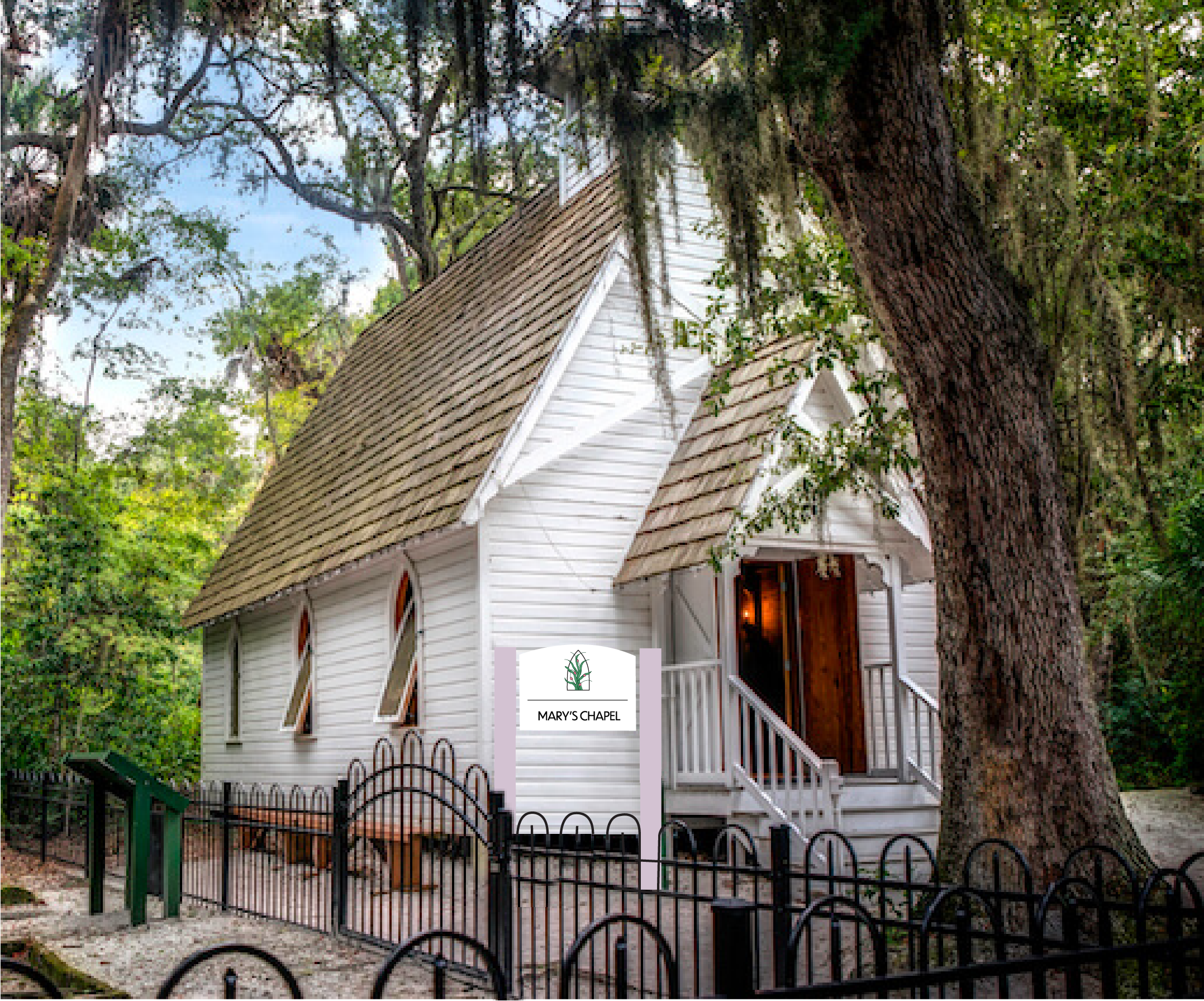
Spanish Point-Redesign
The design challenge for this project was to modernize the aesthetic of the Historic Spanish Point while respecting its rich heritage and natural surroundings. The goal was to create a visual identity that stands out within the lush green landscape while emphasizing the site’s historical and architectural elements.
The target audience includes history enthusiasts, tourists, and local visitors drawn to the site’s beauty and historical significance, particularly Mary’s Chapel.

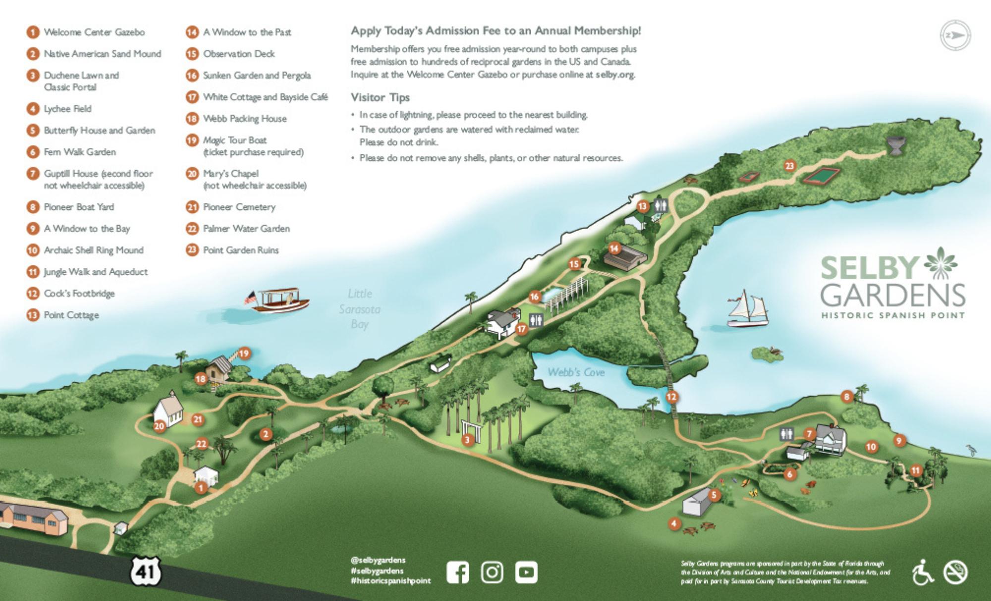
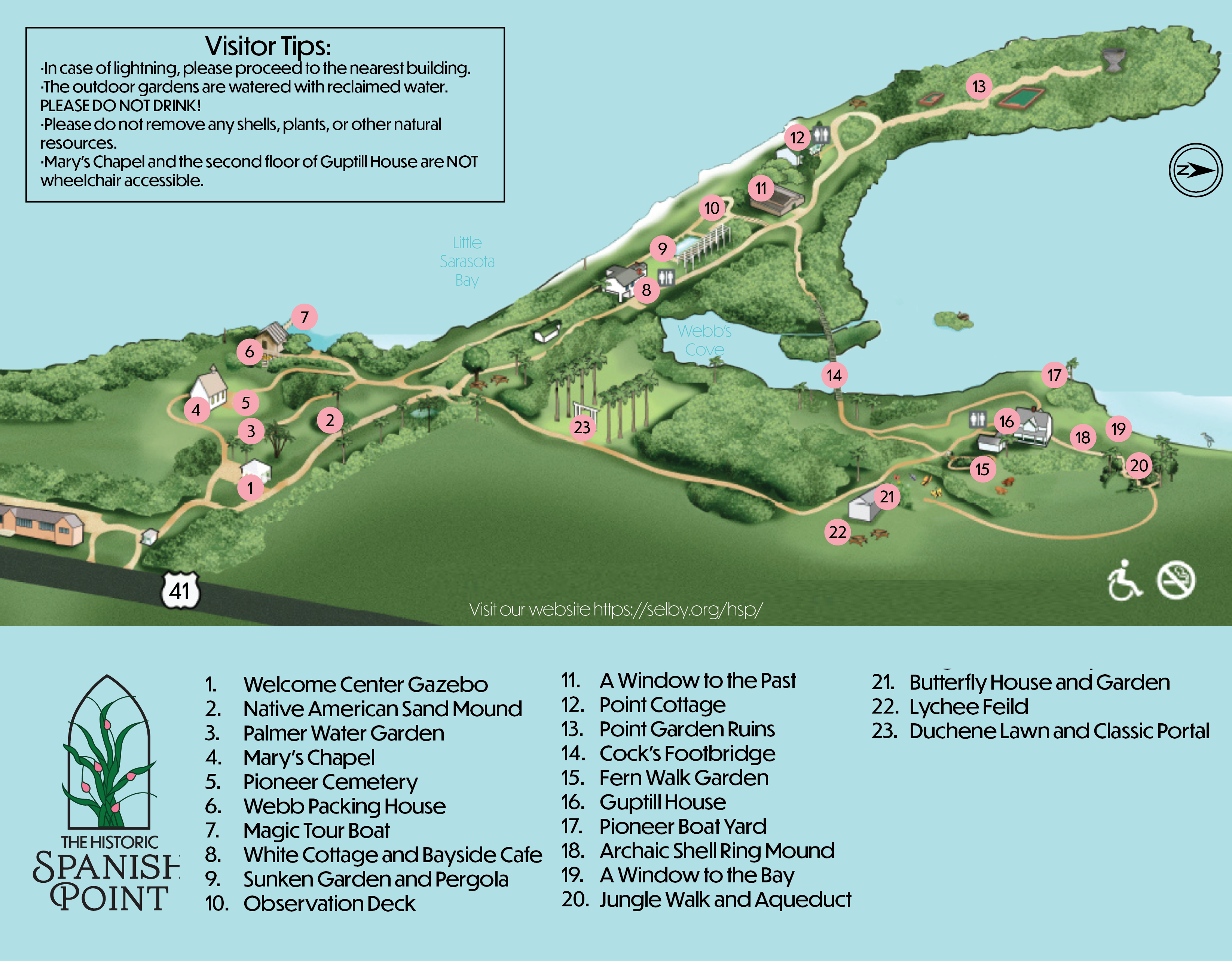
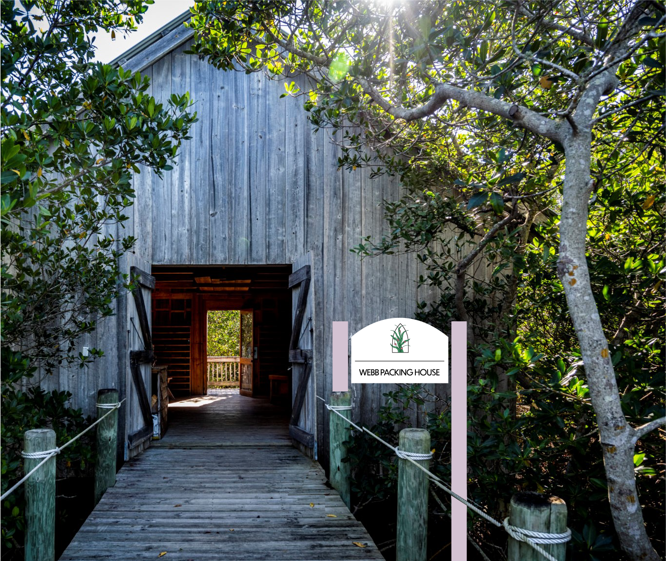
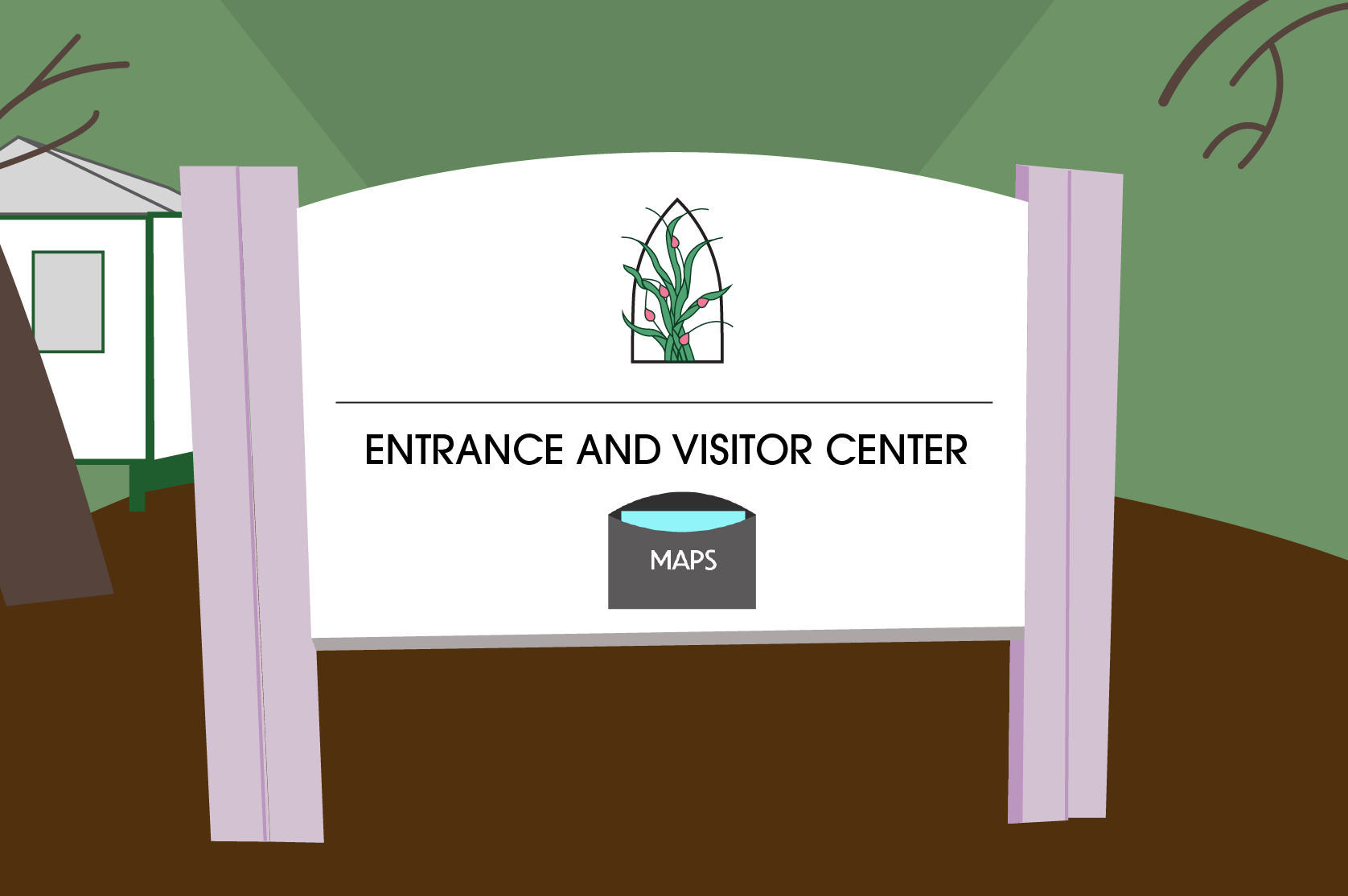
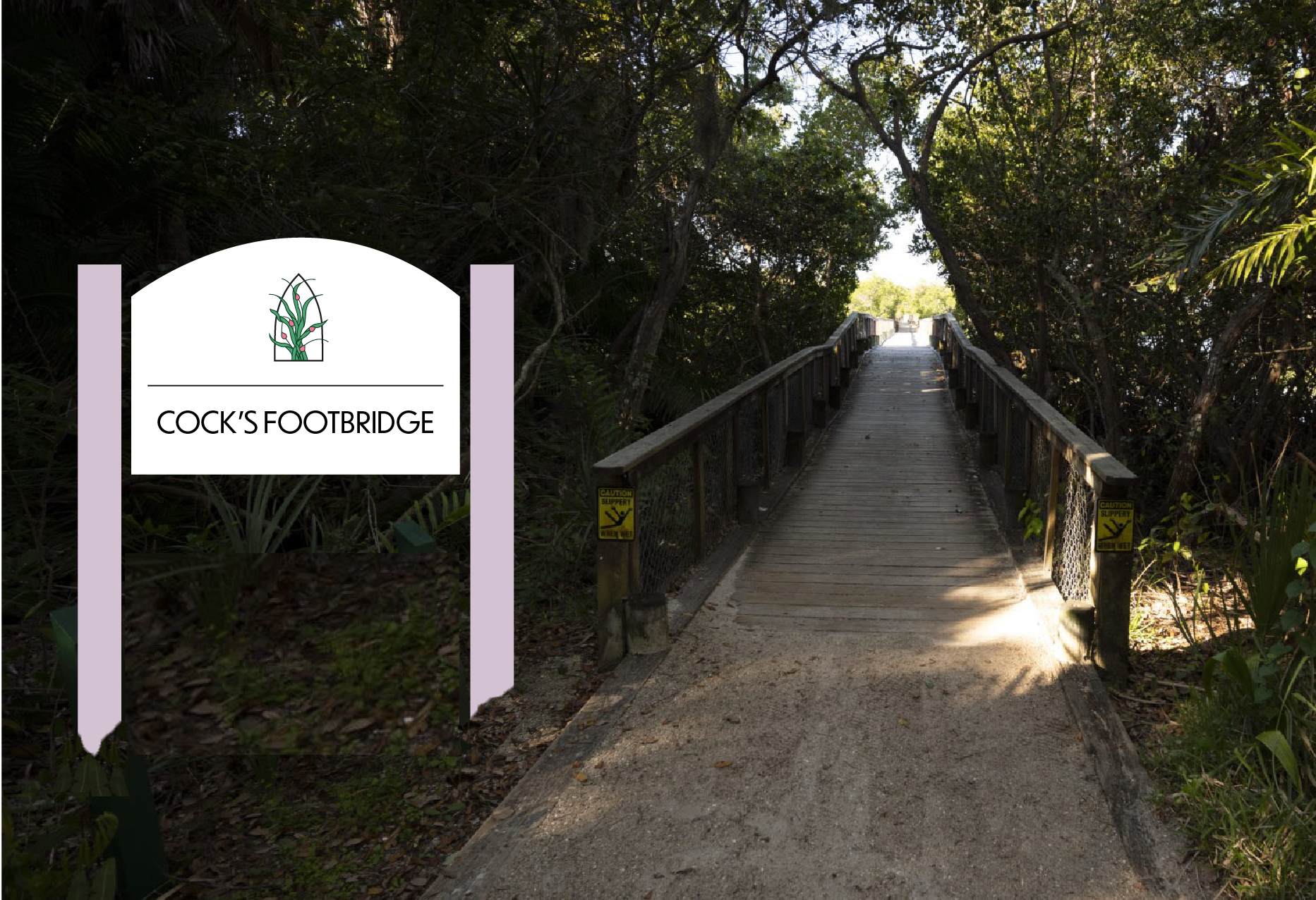
To achieve these goals, the design incorporates a palette of pink and white hues, bringing a fresh, modern contrast against the greenery of the environment. The signage prominently features these colors, ensuring visibility while contrasting the natural surroundings. Wood elements are heavily integrated to reflect the area’s architecture, much of which is constructed from natural wood materials.
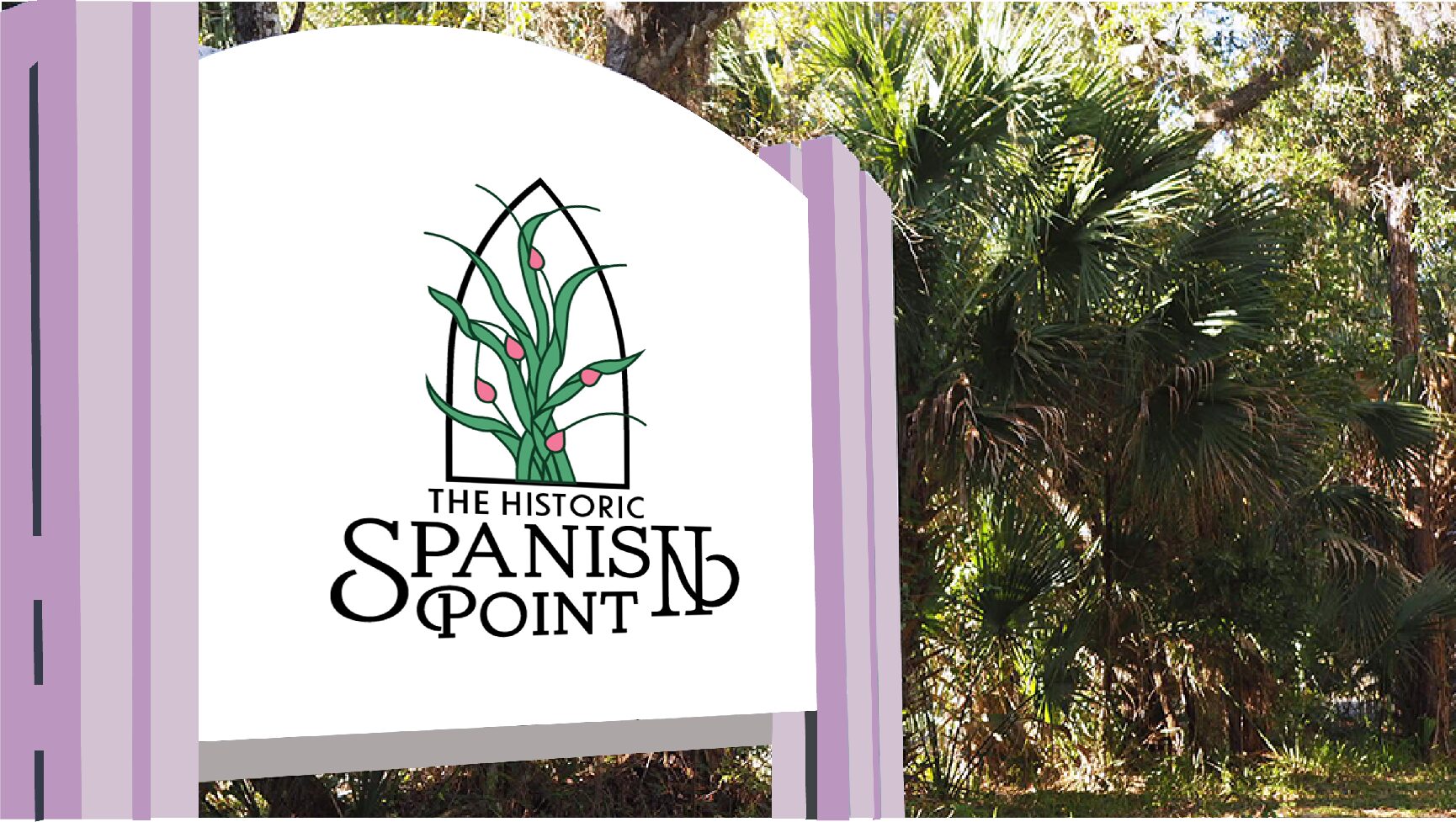
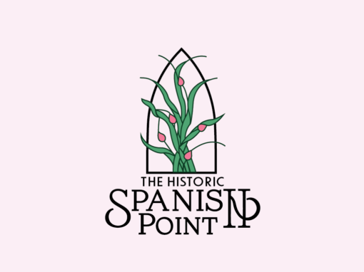
The logo design embraces a completely unique approach. Drawing inspiration from the stained glass window of Mary’s Chapel, echoeing its beauty and creating a symbol that resonates with visitors.
By blending modern aesthetics with historical and natural references, this design effectively balances heritage with contemporary visual appeal, inviting visitors to connect more deeply with Historic Spanish Point’s history and charm. The thoughtful use of color, materiality, and symbolism successfully fulfills the project’s goals of modernization without sacrificing authenticity.
More Work:


